
IFANOW
Business Intelligence
Making BI reports easy to discover, find and make.

goal
Fixing one of the most flagged modules on the fintech platform as we prepare for our userbase to grow 10x
my role
Self-initated:
Research
Mental Models
Design pitch
Prototype
team
Me


> context
At IFANOW, I share an office with relationship managers who handle clients all day
I get to hear all of it. The outbursts, the confusion, the… desperate pleas? When I hear interesting conversations, I listen in.

client
!

rm

ME, nosing in
This project started with one such client.
business intelligence (BI)
noun - /ˈbɪz.nəs ɪnˈtel.ɪ.dʒəns/
Technology-driven process that analyzes business data and transforms it into actionable insights, helping executives and managers make better-informed decisions.
IFANOW's BI is a powerful feature.
As I learned, however, it also has serious problems.
"
Please, fix BI. It is so hard to use.
There has to be a better way.
Client
"
It's really complicated for most users, so much so that they offload the task to us, asking us to find the report and create it for them.
Relationship Manager
"
"BI gets some of the most tickets among all the modules on the platform, it's really tough to get used to. Buggy and error-prone"
Relationship Manager
"
It takes even us RMs time to figure out our way around BI"
Relationship Manager
So far, the RM team was still able to sustain this level of flagging, but we were growing quickly,
very quickly
The module needed to be self-sustaining, without requiring constant guidance from support. I started a plan to fix it.
> the problem(s)
The core problems boiled down to poor searchability.
> addressing the user types
The current structure assumes a one-size-fits-all+you-figure-it-out approach.
In reality, different user types needed different levels of guidance.
new to bi
finding reports they could start with.
intermediate users
exploring beyond the essential reports.

power users
creating hyper-personalised, detailed reports.
> the goal
A simple business intelligence dashboard that grows and adapts to the advisors' workflow and comfort.
> building mental models
Our users are change averse. I didn't want to create a new design too alienating, so I mirrored traditional file creation workflows
I rooted my process in Jakob's law: users expect your product to feel similar to other prducts they use.
With this in mind, I turned to the primary tools our clients use.


This model seemed to be universal. I noticed it in more than 10 softwares.
1. Highlighted new reports
2. Recently used
3. Favorites
For its complete familiarity alone, it became a clear winner. These aspects helped, too:
progressive disclosure
fast scanning
findability
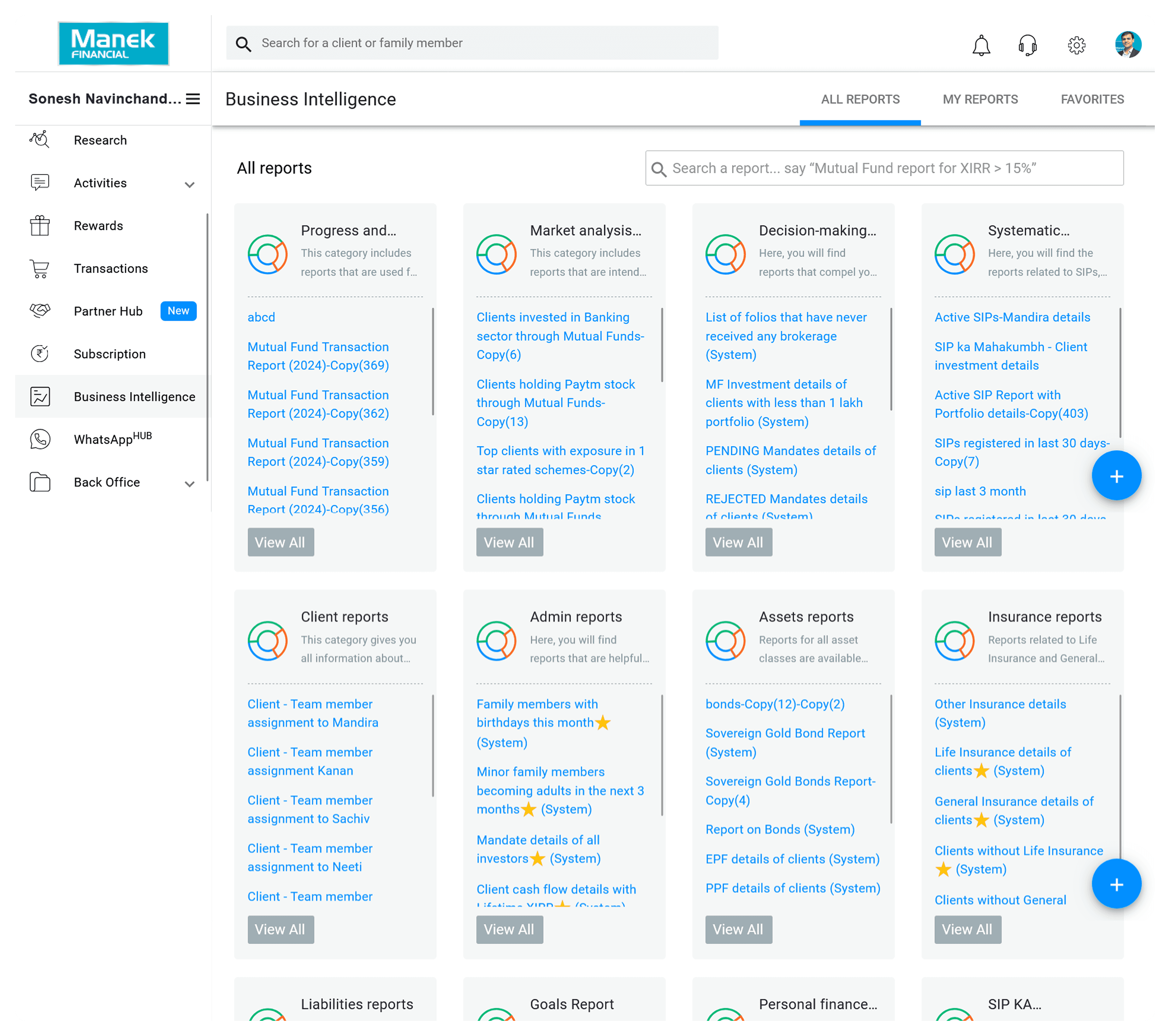
I expanded on the Microsoft model to adapt to our wider use cases.

New
Active
Power
I created new sections, and removed some, to adapt to each user type.
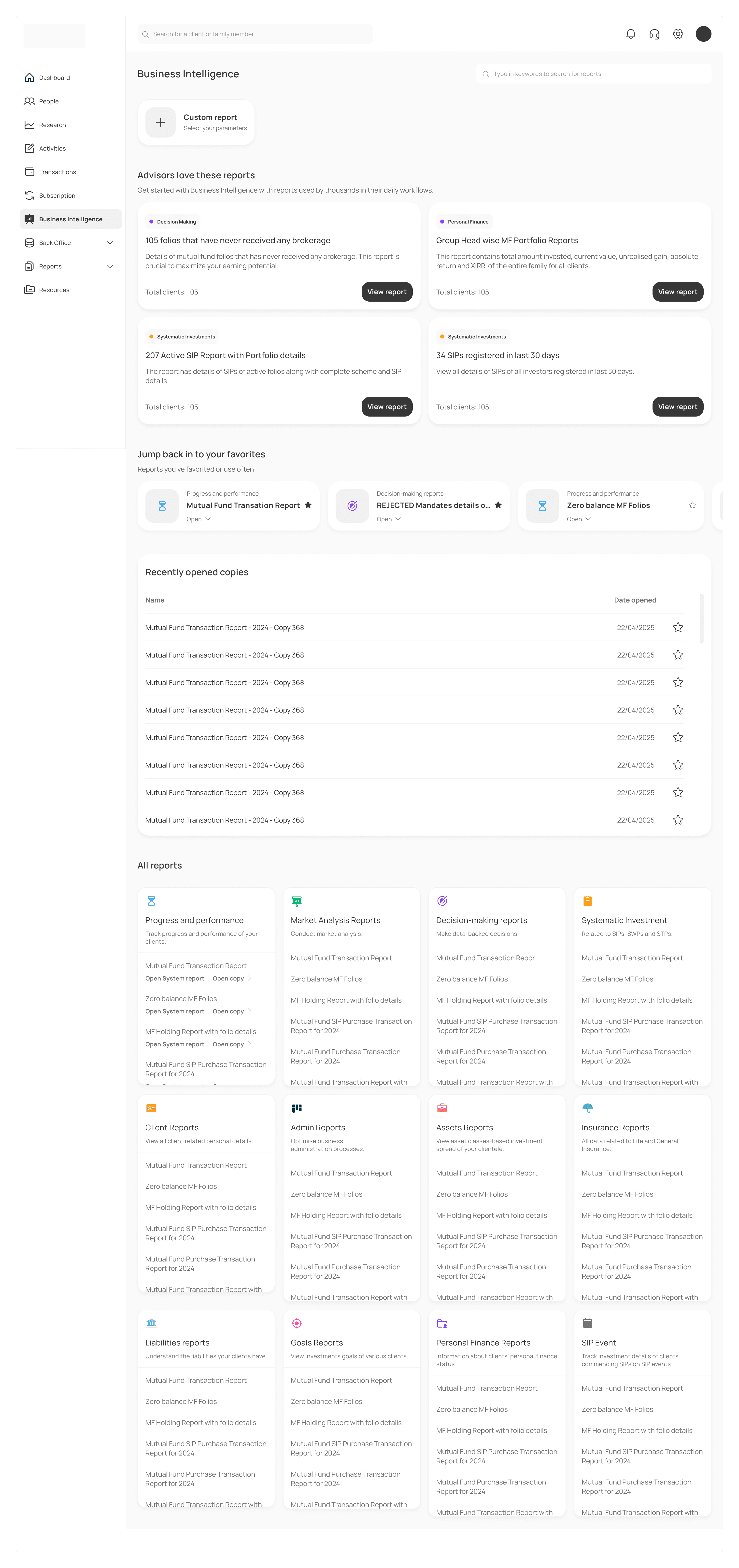
Popularly used reports and Recommended reports help introduce them to reports they can easily fit into their workflow.
3 new sections centered on easy findability.
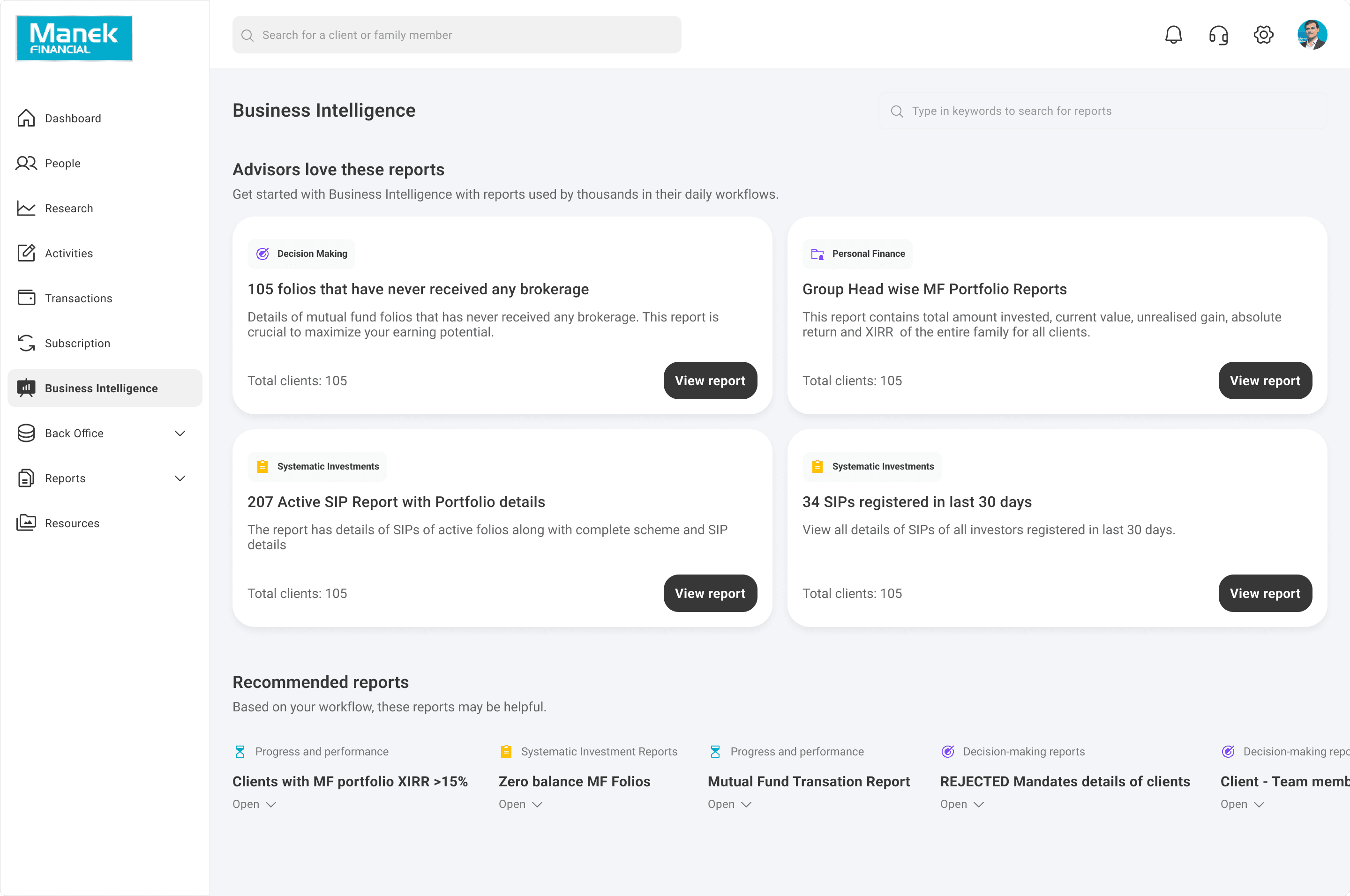
Popular reports

Ready-made reports relevant to all advisors' workflows, these reports are simple and ease users in to BI.
Your commonly used reports

There are some reports advisors use constantly. They can now pin them to see them at the top along with other reports we notice they use often.
Recently opened

Most advisors tend to return to the reports they used before, so I listed them together. The date of opening helps them identify important reports even when they didn't rename them.
All reports

This section lists all categories, now color-coded so advisors gain muscle memory of the purpose of each report type.
The redesign also involved a relook at the design language of the page.
This case study is only available on desktop at the moment :)

© 2025 Nandini Vyas. All rights reserved.
Made with tables and data and number and lists and so on.