HealthifyXBerryStreet
US Pilot
Making the Healthify app work for US insurance covered dietitian care.
goal
Ensuring patients show up for their dietitian appointments.
my role
Onboarding Strategy
Web Flow Redesign
Appointment layer design
team
Me
Sahil Kutty(Lead Product Designer)
Himanshu Dang(Product Manager)
timeline
2 weeks


> impact(over two months)
Show up rate
71%
vs 39% non-app users
DAU
40%
User sent messages
64%
> the RD Space in America
In the USA, insurance plans cover dietitian appointments.
Berry Street connects said dietitians with patients looking for one.

Insurance
Pays the bill

dietitian
Gets paid

Takes commission
Helps patients find a dietitian

patient
Pays $0
1.0
How the model works
patient
>Free isn't enough to make me care.
This means 6 in 10 booked appointments were generating zero revenue while consuming real costs. We had two weeks to improve these number and see if Healthify would bring value to a merger.
> the hypotheses
We dug into the US booking to appointment experience. We noticed two glaring problems.
A patient had to go through 33 questions before they can book their appointment.
33 straight input fields with nothing in return until the very end. For most users, that's too much for something they're just trying because it's free.

2.0
33 of these. Excruciating.
The space between booking and appointment was dead air.
Nothing was happening in that window to reinforce the decision or acclimatise the user to speaking to a dietitian.
Okay, I've booked the flow. Now what.
3.0
A Patient's thought process

+

?
These issues brought us to some questions:
What if the web booking built confidence instead of just collecting information?
The sign up is the first experience a user has with the product. This redesign uses it to answer the question every new user is already asking: will this actually work for me?
What if the care started even before the appointment?
Berry Street has the dietitians. Healthify has the tools. Together, they could make care feel holistic.
What if building familiarity with the dietitian made the first session feel less intimidating?
Most patients arrive at a first appointment carrying the burden of vulnerable context, past experiences and history. If the dietitian already knows something about who they are, the burden can lift.
> part one: the web flow
I restructured some parts of the flow around Reasons to Believe (RTBs). Every time a user crosses a threshold of vulnerability (sharing a goal, admitting a number, making a commitment), we return something of value.

4.0
Social proof

4.1
The program design

4.2
The weight loss chart

5.0
Download app
> Part 2: the app
The user's transition from web to the app is where maintaining the user's trust became critical.
Healthify's design language, and, well, name, is different. Users coming in would feel out of place.
Berry Street's design

6.0
How Berry Street's site looks
vs
Healthify's

6.1
How our app does
In two weeks, we had to execute the MVP that could bridge the dissonance between Berry Street and Healthify.

7.1
Daily Limit Error State
> the splash screen
Positioning Healthify as part of Berry Street's care system
We had to explain where Healthify came into the picture - were we partners? was it an external tool? Health, especially clinical health, had to be trustworthy. Since users were comfortable with Berry Street, we decided to position Healthify as a product of Berry Street.
7.2
Daily Limit Error State
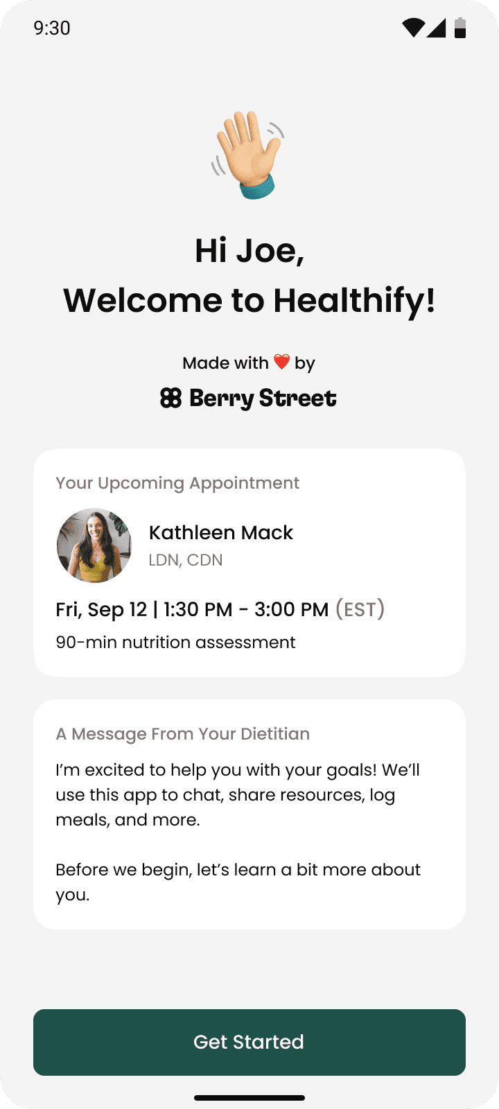
> the pre-onboarding message
A message from your dietitian before you start onboarding
The app onboarding requires yet another set of answers from the users. The dietitian affirms that these help in their care.
> an intro to the app
After onboarding, we have them try the food log experience themselves. And then, a video message from the dietitian.
Now, they've already invested something — which makes them slightly more likely to come back.
In the video message, the dietitian explains why this app in tucked into their care experience - to support more evidence-based care so the dietitian gets a gist of the user's actual lifestyle habits instead of generic advice.
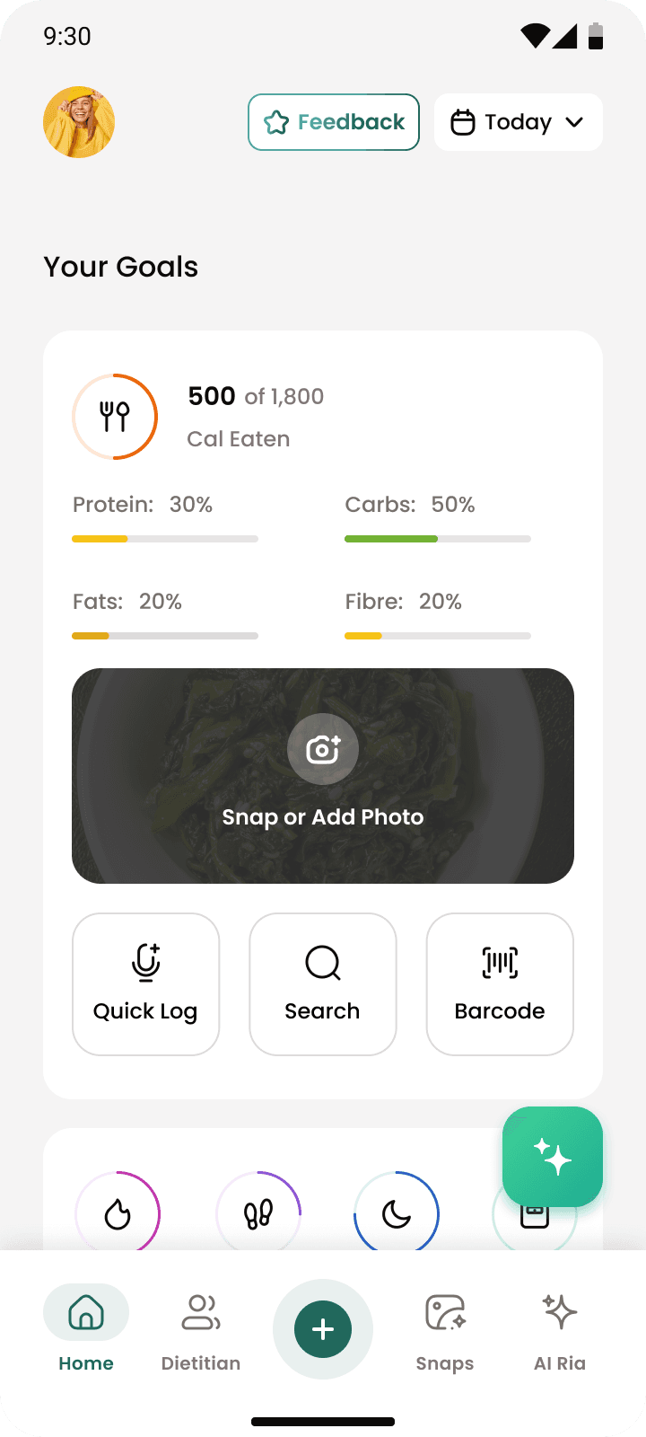
8.0
Snap your first meal


8.1
Set up complete

8.2
RD's app guide
The video was a conscious effort. We had to align all the dietitians to make it and make sure it was made well.
9.0
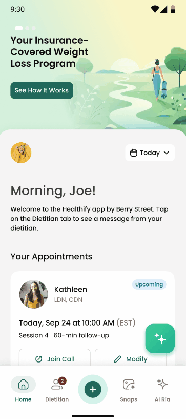
Upcoming Appointment on the homepage
Their upcoming appointment comes up top in the homepage. We wanted it to be impossible to forget.
> a place for all appointments
The dietitian tab was the new space for American users' appointment information
The tab leads with the dietitian - her photo, credentials and the option to chat with her before anything else. Appointments, insurance, session history all come after. The hierarchy was deliberate: the relationship is the product.

Insurance details are surfaced without asking so users don't have to worry about it.
10.0
The Dietitian Tab

> what's next?
The MVP app was released on the Feb 27, and the results were good. Really good.
But that was just one appointment. There were many more needed to achieve the lifestyle change we wanted to achieve.

11.0
The Journey(WIP)
> the pre-onboarding message
The journey (WIP): From showing up once to completing the program.
For the next phase, I'm building a Journey Page where sessions are levels instead of calendar slots. Users can see exactly where they are in the phase, what completing it gets them, and that something bigger is waiting on the other side.
Some things I learned
Designing for a clinical product
can be very different from a consumer wellness app. The compliances around insurance and HIPAA define a lot of design decisions. Despite both essentially being about dietitian services, user behaviour also changes when it gets a clinical label.
Deciding the most feasible MVP
This is something I've dealt with in endless projects. But this was different. Higher stakes. It defined the possibility of our US launch. And whatever decision we made had to be the best one we could.
© 2025 Nandini Vyas. All rights reserved.
This is how I learned my insurance is not very good.